 Understanding elements of art or design can give you a good perception of what it takes to produce work that can make an impact on viewer or simply deliver the message.
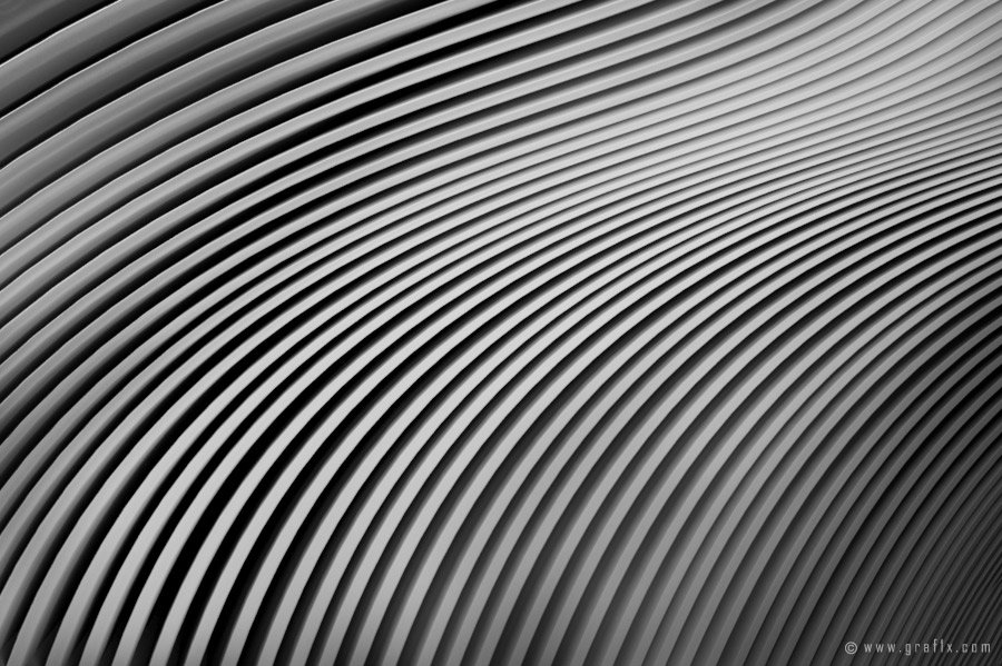
HORIZONTAL, VERTICAL AND DIAGONAL LINES
Line is capable of affecting how the viewers’ eye moves over the artwork. Long, short, thick, thin, straight, curved; line engages the eye and ultimately tells the viewer where to look. Line has the ability to create movement, encouraging the viewer to take a particular “route” as they look over design. Line can also evoke feeling for example; strong black vertical lines can give a sense of stability and structure, where as wavy curved lines may be felt as serene and calming.
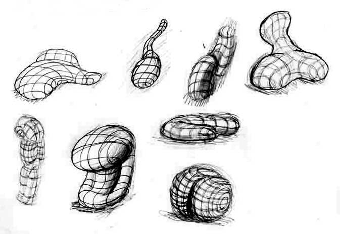
ORGANIC AND GEOMETRIC SHAPES
In particular there are two types of shapes that are described in visual design. They are geometric shapes and organic shapes. Organic shapes commonly depict nature and shapes inspired by the natural environment. Organic shapes are used in art and design to illicit free flowing and spirited feelings. Geometric shapes are more fixed and rigid and often used to represent our man made environment such as skyscrapers and roads. Geometric shapes can promote a concrete feeling of stability and structure.
 SPACE, DEPTH AND PERSPECTIVE
Space pertains to what is happening in the design around the previously mentioned shapes and lines. Space can be used to create dimension, depth and perspective.
VALUE OF COLOR
Value is an element of color that describes the tint and shade of the pigment. Colors that have been lightened with white are referred to as tints where as colors that have been darkened with black pigment are called shades. Designs that use only tints and shades of the one color throughout the entire artwork are referred to as monochromatic. Varying of the value within an artwork will also create contrast for the viewer.
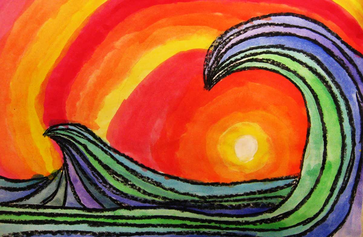
COLOR
 Certain colors are commonly associated with particular moods and feelings ( Please read Meaning of Colors ). The way that designer or artist uses color will affect the temperament of a design and can potentially influence how the viewer feels. Whether a color is warm, cool or neutral can promote different frames of mind and impact the space in which it is displayed. Color is a significant component particularly when used in marketing and product design. Primary, secondary and tertiary colors combined in different ways creates visual impact and aims to captivate the intended audience. You can learn more about color theory in The Color Wheel page.
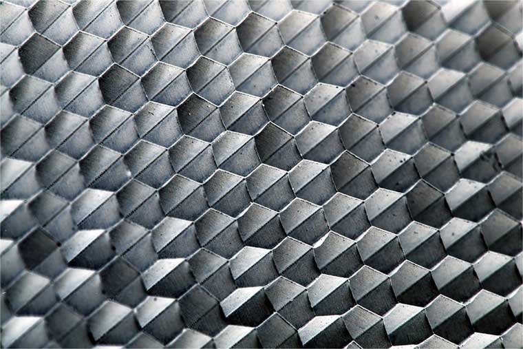
TEXTURE
 Texture pertains to the physical feel of an artwork. Texture can be achieved through the medium used (types of paint such as oil, acrylics or pastels) and also by the surface it is applied to whether it is canvas, paper, fabric or timber. It is important to remember that texture can be created in the tangible, physical sense; i.e. that the artwork literally feels rough or bumpy when touched. Texture can also be an illusion, giving the appearance of texture when in fact the surface is smooth.
No Comments