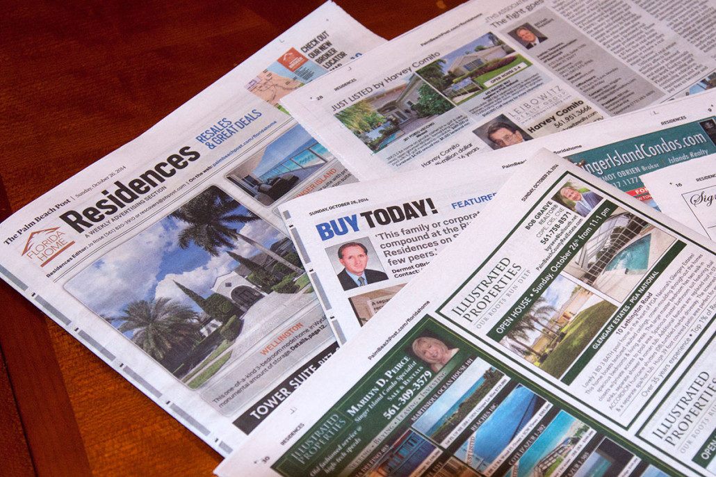
 It is important to brand ourselves, include a logo, phone number and pictures; however, a lot of times we do not pay attention to other elements that are way too crucial for successful ad. As a professional graphic designer, I have analyzed over 100 real estate listings in Palm Beach Post that captured my eye, and pointed out tips that will make your ad stand out in terms of visual impact, which will in turn increase your conversion among the competition.
While these tips may not seem that important to you, I can guarantee that if you follow them, your conversion rate will increase, and you will be ahead of your competitors. So let’s begin.
IMAGE SIZE MISTAKE
I see agents trying to include as many properties as they can in their newsletter ads, which results in super small sized images. I understand that we want to get more out of the space that we have paid for, but does it really work in our favor? As humans we mostly buy things with our eyes, and visual hierarchy in design states that bigger images will always have more importance over the rest. By analyzing newsletter ads, I concluded that you should not go for images that are less than 1.75 inches in width. It is not about quantity but about visual impact. If you have 8 properties to advertise, consider including 4 that have better sale potential, and show them in a larger scale. Regarding the picture quality especially in newspaper ads be very selective as reproduction quality goes down as soon as darker tones come in. Use only bright pictures with as few shadows as possible. Always choose pictures where light source is making your property brighter.
USE OF COLOR
The amount of real estate ads in newspapers is huge! It is very hard for the reader to go over all the text in your listing. A handful few actually goes through all details. Opposite to pictures, your textual part should be minimal, and in appropriate text size. In order to include everything we want in our ad, we are ready to sacrifice size. This simply leads to almost unreadable block of description. It is much easier for your potential client to read 3 top key selling points in appropriate size rather than a piece consisting of 5 sentences requiring a magnifying glass. Trust me, I can see ads on my table at this point listed in Palm Beach Post, where I cannot even read the text.
AVOID DARK COLORS
What came as a shock to me is the huge number of listings using intense dark backgrounds against super valuable information like your contact number. It is a print quality issue (mostly newspaper). Dark colors require a lot of ink, which bleeds into your white text thanks to the low quality paper, and makes it almost unreadable. While it may look super awesome on the screen, a printed ad is a totally different story. I know blue is the most used color in Real Estate Direct Mail Marketing and it’s fine to use it, but it would be great if you can pick a lighter tone. Be sensitive about color use. Remember, more does not mean better. It is best to stick with one or two colors that represent your brand. In addition, avoid using gradients.
PROPER AD POSITION
I don’t know if newspapers advertise this to their clients, I don’t think so, but you have the best chance if your ad is on the outside of the page. If you ad falls against the fold of the paper, your readership will be cut by half.
PROPER TYPEFACES
I have seen this issue in some cases, and most people are aware of it. Try to use Serif typeface or something similar to what people are used to in newspapers. Poor typeface choice will lead to decrease in comprehension by at least 50%. Proper size and type will increase the number to 300%. Limit your font use to no more than two types.
NEED HELP WITH DESIGN?
No problem, just visit my website at http://prographicworks.com and send me a message. Together we will produce an ad that will pop out and capture lots of attention.