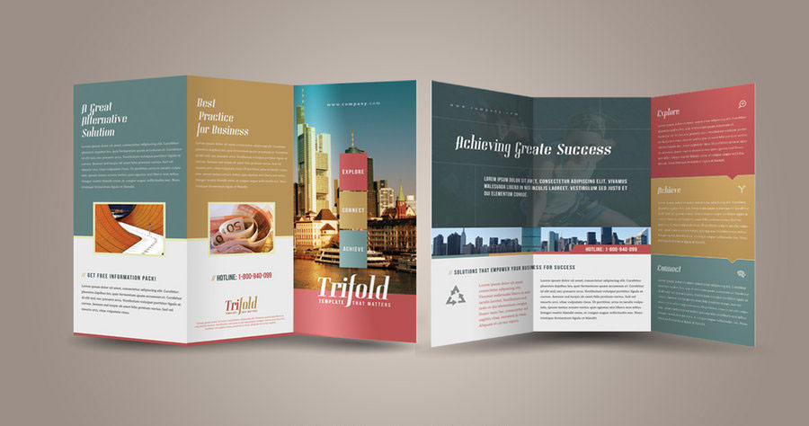
 For many businesses, the brochure is the back-bone of their marketing campaign. A well designed brochure can be a cost-effective marketing piece, used to put a targeted message directly in the hands of a potential customer. As an integral part of the buying process, brochures can help promote a sale, respond to informational inquires, introduce your company, products and services, or be used in a direct mail campaign.
There are typically two types of brochures, as listed below:
1.Tri-fold brochure – a standard sheet of paper, folded three times to create six panels (one front, four inside, one back). This is the most common type of brochure and is typically used to promote products and services or used as direct mail pieces.
2.Bi-fold brochure – a standard sheet of paper, folded two times to create four panels (one front, two inside, one back). This type of brochure is typically used for informational brochures, as it allows for more content space.
Whether you use a tri-fold or bi-fold brochure, below are some design tips to keep in mind:
ENGAGING IMAGES
Images are powerful and can make or break your brochure. Your images should evoke an emotional response from your reader, prompting them to make a decision to use your company. Use of full-size images and image captions can emphasize a point.
ENGAGING HEADLINES
Your headlines are usually the first piece of information read on your brochure, therefore they must grab the attention of your reader. Effective headlines can include writing your headline like an announcement (treat it like a newsworthy event), by asking an engaging question (touch on the interests of the audience), or by telling your reader exactly what to do (simple instructions that are straightforward).
YOUR BRAND COLORS
Your color choice can have an impact on your target market. Colors are visually appealing if used correctly. The correct colors will draw attention to your brochure and provide an emotional experience for your reader. Your company’s official colors will solidify your branding and create trustworthiness.
POWERFUL COVER
Your brochure cover will need to capture your readers’ attention and invite them to look inside. It must be visually appealing, especially if it will be displayed on a literature rack. The top-third of your brochure cover should be powerful enough that your potential customer will know the focus of your brochure within ten seconds of viewing.
An effective tri-fold or bi-fold brochure design will be consistent with your other marketing materials and company brand. Your design should be unified across all panels of the brochure, keeping in mind how it is presented to the reader when unfolded.
No Comments