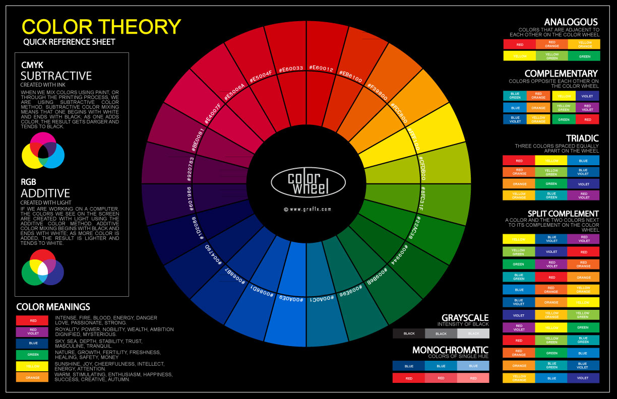
The color wheel poster is a visual tool, used to help us comprehend and apply the principals of color theory. The application of the color wheel encompasses a vast collection of areas, such as art, architecture, fashion, and interior design. Whether it is art, graphic design, photography, textile design or package design, the application of the color wheel poster will create an emotion that ties us to the image, art or design.
HISTORY OF THE COLOR WHEEL
The original color wheel chart was created by Sir Isaac Newton, in 1666. His focus on the nature of light and color, and experimentation slitting sunlight with a prism lead to his color circle. Newton’s first color circle was actually more of a pie chart, in which the bands of color he observed were dispersed in wedges, arranged around a circle. The prism produced red, blue, yellow, green and cyan. This allowed him to show the natural sequence of color by joining the two ends and creating the color wheel.
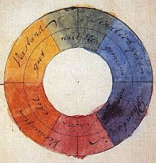
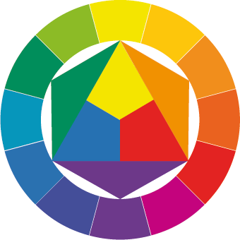
 By the mid 1900’s, a German theorist, Johannes Itten, developed the color wheel we know today. He took into consideration Johann Wolfgang von Goethe’s hypothesis of the emotional value of colors, such as blue was associated with coolness and red was associated with warmth. His color wheel was based on the primary colors and contains 12 colors.
These 12 colors are as follows:
Primary – RED (see shades of red) , BLUE (see shades of blue), YELLOW.
Secondary – PURPLE, GREEN (see shades of green), ORANGE.
Tertiary – red-violet, blue-violet, blue-green, yellow-green, yellow-orange, red-orange.
There are three basic categories of color wheel – the color wheel, color harmony and context. Color theory generates a logical structure for color, but can encompass a host of definitions, concepts and design applications.
As mentioned above, the color wheel contains three primary colors, three secondary colors and six tertiary colors. The primary colors are thought of as traditional colors and cannot be mixed or formed by any combination of other colors. All colors are derived from these three hues. The secondary colors are formed by mixing the primary colors and the tertiary colors are formed by mixing a primary and a secondary color.
Color harmony refers to conveying a visually pleasing arrangement, and engages the viewer by forming balance and an inner sense of order. There are three basic theories in relation to color harmony – a color scheme based on analogous colors (any three colors side-by-side on the color wheel), a color scheme based on complementary colors (any two colors that are directly opposite each other on the color wheel) and a color scheme based on nature (derived from natures images such as plants).
A multifaceted area of color theory is how color behaves in relation to other colors. Comparing colors and their effects is color context. Color context is used in many optical illusions, as contrast and placement will trick the eye in perceiving movement or depth of the design. Saturation, placement, hue, darkness and lightness all play a role in the context.

No Comments