Color Theory applies to the system through which we are able to create a reasonable structure for color. Using color theory, we are able to anticipate the visual effects of specific color combinations and predict how different colors will react to each other when mixed.
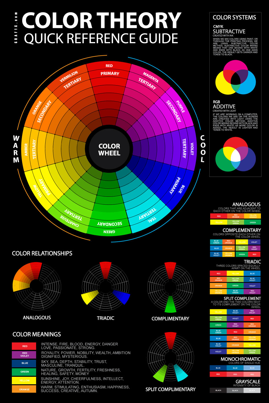
The attached color theory poster, chart includes a visual of the color wheel, as well as diagrams to illustrate how color schemes are created. By using the color theory poster artists, designers, painters or students will have a greater understanding of how basic color theory applies when determining what colors to use in a project. Color theory chart includes a visualization and explanation of how colors are created digitally and through printing using RGB additive and CMYK subtractive methods.
To better understand color theory basics, one must begin with the color wheel. The color wheel is made up of twelve colors, including three primary, three secondary, and six tertiary colors.
Color Hues, Tints, Shades
The unmodified, or “pure”, forms of these twelve colors are referred to as Hues. Hues can be modified to suit an artist’s mood or project by adding black, to create a shade, white, to create a tint, or by adding both black and white to create a tone. All of these aspects form the basis of color theory and allow an artists, designers and painters to anticipate the visual effect of a planned color scheme.
It is important to note that, when deciding upon a color scheme, the base hue of the colors you are using, and their placement on the color wheel, will determine the visual effect of the end result. As such, it is vital to apply knowledge of color theory to develop the color scheme of your project. By making use of the information on the attached color theory poster to determine the base hue of the colors chosen, one is able to develop a visually appealing color scheme.
Color Harmonies
Monochromatic color scheme
One of the most simple color schemes is a monochromatic color scheme. Monochromatic color schemes can employ a variety of tints, tones, and shades, but all colors used will stem from the same base hue.
Grayscale color scheme
Grayscale color schemes are similar to monochromatic color schemes in their simplicity. However, grayscale color schemes do not employ any base hue and fall outside the original color wheel. Instead of being based on a hue, a grayscale color scheme is created by mixing of various shades of black, gray, and white.
Analogous color scheme
Analogous color schemes involve two or more colors that sit directly beside each other on the color wheel. It is interesting to note that an analogous color scheme can involve several different hues and is not limited to a specific number. However, in order to be considered analogous, the color scheme must have a minimum of two hues and all must be connected on the color wheel.
Complimentary color scheme
Complimentary color schemes, similar to analogous, employ a minimum of two base hues. However, in complimentary color schemes the base hues sit directly opposite each other on the color wheel.
Triadic color scheme
Triadic color schemes are slightly more complicated, involving three completely separate hues. Triadic color schemes involve three hues evenly spaced from each other on the color wheel. It is interesting to note that all three hues will be of the same color type, primary, secondary, or tertiary.
Split Complimentary color scheme
Split complimentary color schemes also involve three separate hues. In split complimentary color schemes two of the three colors will be spaced closer together than the third, separated only by the third color’s opposite on the wheel.
Color Systems
As illustrated on the attached color theory poster, the method of creating the chosen colors is dependent on the media through which the project is completed. Digitally, we are able to create color using light in an RGB additive system. In RGB additive, one begins with black and adds light and color, with the added color creating a lighter result as one progresses towards white. However, using physical printing methods, we use a CMYK subtractive color system which is, in essence, reverse to RGB additive. In CMYK subtractive, one begins with white and adds ink or paint to create a darker surface. As color is added, the result becomes darker and tends towards deep shades, ending in black.