SaddleBrown and Turquoise
Split-Complementary color combination with 3.15:1 contrast ratio
Color Values
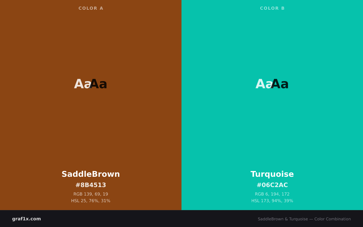
#8B4513139, 69, 1925, 76%, 31%#06C2AC6, 194, 172173, 94%, 39%Harmony: Split-Complementary
This is a split-complementary pairing: one color paired with the two neighbors of its complement. It offers most of the contrast of a complementary scheme with less tension, making it easier to balance.
The hue angle between SaddleBrown and Turquoise is 148 degrees. You can explore these relationships interactively in our Color Wheel Tool.
WCAG Contrast
UI Preview
SaddleBrown surface
Sample text on a saddlebrown background demonstrates readability and visual hierarchy.
Turquoise surface
Sample text on a turquoise background demonstrates readability and visual hierarchy.
Design Tokens
CSS Variables
:root {
  --color-a: #8B4513;
  --color-b: #06C2AC;
  --color-a-rgb: 139, 69, 19;
  --color-b-rgb: 6, 194, 172;
}
JSON
{
  "name": "SaddleBrown and Turquoise",
  "colors": [
    {
      "name": "SaddleBrown",
      "hex": "#8B4513",
      "rgb": [
        139,
        69,
        19
      ]
    },
    {
      "name": "Turquoise",
      "hex": "#06C2AC",
      "rgb": [
        6,
        194,
        172
      ]
    }
  ],
  "harmony": "Split-Complementary",
  "contrastRatio": 3.15
}
Related Combinations
Explore These Colors
Frequently Asked Questions
Do saddlebrown and turquoise go together?
Yes. SaddleBrown and Turquoise form a split-complementary color combination. This is a split-complementary pairing: one color paired with the two neighbors of its complement. It offers most of the contrast of a complementary scheme with less tension, making it easier to balance. The pairing has a WCAG contrast ratio of 3.15:1, which passes AA for large text but not for body text.
What is the contrast ratio between saddlebrown and turquoise?
The WCAG 2.1 contrast ratio between SaddleBrown (#8B4513) and Turquoise (#06C2AC) is 3.15:1. This passes AA for large text (18pt+ or 14pt+ bold) but not for normal-sized body text.
How do I use saddlebrown and turquoise in design?
A safe starting point is the 60/30/10 rule: give one color about 60 percent of the surface area, the other about 30 percent, and reserve the remaining 10 percent for an accent or neutral. If one color is significantly darker, use it for text or structural elements and the lighter one for backgrounds. Test the result with our Contrast Checker if text is involved.
What are the hex and RGB values for saddlebrown and turquoise?
SaddleBrown has the hex code #8B4513 and RGB values rgb(139, 69, 19). Turquoise has the hex code #06C2AC and RGB values rgb(6, 194, 172). You can copy these directly into CSS or use the design tokens provided on this page.