Pot Pourri Color
Pot Pourri Color Values
What Does Pot Pourri Mean?
Pot Pourri belongs to the orange family of colors. Orange splits the difference between red's urgency and yellow's cheer. Food brands live here because warm oranges read as appetizing, and autumn design would be lost without them. As a rule of thumb, orange feels friendlier than red and louder than yellow. As a lighter shade, Pot Pourri reads as airy and understated, comfortable working in backgrounds and across big surfaces.
In the ISCC-NBS color naming system, Pot Pourri is classified as a white (nearest centroid: pinkish white, #EAE3E1). It is also known as Potpourri.
Color Harmonies
Complementary
Analogous
Triadic
Colors That Go With Pot Pourri
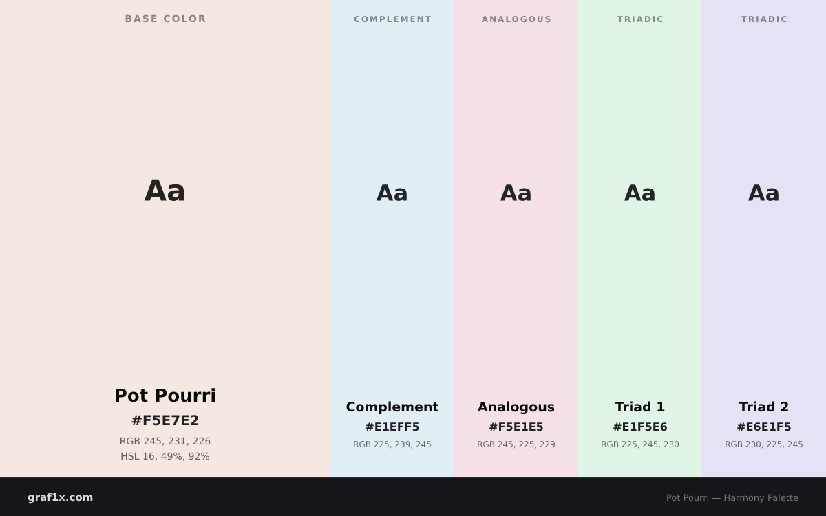
Pot Pourri and #E1EFF5 are complements, parked opposite each other on the wheel. Together they hit maximum contrast, so a rough 70/30 split keeps the pairing from shouting.
Analogous neighbors — #F5E1E5 and #F5F0E1, which sit beside pot pourri on the wheel. Pairings like this feel calm and settled, which suits backgrounds and gradients.
For an energetic three-color palette, pair pot pourri with triadic partners #E1F5E6 and #E6E1F5. All three sit evenly spaced around the wheel, so the scheme stays lively without clashing.
Build and test these combinations in our Color Wheel Tool or check text readability with the Contrast Checker.
Pot Pourri Color Combinations
Explore two-color pairings with harmony analysis, contrast ratios, and CSS design tokens.
Browse all color combinations →Tints and Shades
Tints (lighter)
Shades (darker)
Similar Colors
- Dawn Pink —
#F3E9E5(Delta E 2) - Bizarre —
#EEDEDA(Delta E 3) - Fair Pink —
#FFEFEC(Delta E 3) - Bridesmaid —
#FEF0EC(Delta E 3) - Forget Me Not —
#FFF1EE(Delta E 4)
CSS Examples
.text { color: #F5E7E2; }
.background { background-color: #F5E7E2; }
.border { border: 2px solid #F5E7E2; }
.shadow { box-shadow: 0 4px 6px #F5E7E240; }
WCAG Contrast
Frequently Asked Questions
What is the hex code for pot pourri?
Pot Pourri has the hex code #F5E7E2. In RGB notation it is rgb(245, 231, 226), in HSL it is hsl(16, 49%, 92%), and its OKLCH value is 0.938, 0.017, 40.8.
What does the color pot pourri mean?
Orange-family colors like pot pourri carry distinct psychological associations. Pot Pourri belongs to the orange family of colors. Orange splits the difference between red's urgency and yellow's cheer. Food brands live here because warm oranges read as appetizing, and autumn design would be lost without them. As a rule of thumb, orange feels friendlier than red and louder than yellow. As a lighter shade, Pot Pourri reads as airy and understated, comfortable working in backgrounds and across big surfaces.
What colors go with pot pourri?
Pot Pourri has three easy routes: its complement #E1EFF5 for punch, its neighbors #F5E1E5 and #F5F0E1 for something calmer, or triadic partners #E1F5E6 and #E6E1F5 when you want energy.
Is pot pourri a standard web color?
No — Pot Pourri is not a CSS keyword. Use its hex value #F5E7E2 or any RGB/HSL equivalent in your stylesheets.
How do I make pot pourri lighter or darker?
To lighten pot pourri, add white to create tints; to darken it, add black to create shades. The tints and shades table above shows five computed steps of each, from #FEFCFB (lightest tint) to #391E14 (darkest shade).
About Pot Pourri
Pot Pourri is classified as a White in the ISCC-NBS color naming system, within the Orange hue family. It has alternative names including Potpourri. The color is recognized by Resene, meodai.
Use our Color Converter to convert #F5E7E2 to any other color format, or explore the Color Wheel to find harmonious color combinations.